

Logos are an important part of any brand; it grabs attention, makes a first impression, and demonstrates your brand identity all at once. Some of the best-known brands have changed their logo over the years and we’re about to run you through the brands that did it the best…
Burger King
Burger King launched their new logo in 2021 following the latest trends of mixing minimalism with nostalgia. After two decades of the old logo, the fast-food giant retired its bright and swoopy logo for a more basic and clean looking design based on its older designs. Take a look below and see:

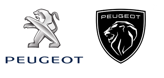
Peugeot
The next decade will be a defining time for carmakers as the auto industry moves toward electrification. As a result, a lot of brands have decided to update their logo, with the best in our opinion being Peugeot. The result is sportier and bold but only time will tell if the redesign will be embraced over the old, iconic lion logo:
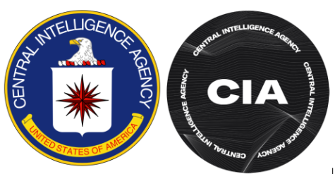
 CIA
CIA
It’s not just big businesses that are revamping their logos. The Central Intelligence Agency is a foreign intelligence agency operated by the US government. The CIA may be the most well-known intelligence agency in the world featuring in all kinds of TV shows, games and more. While they may be prominent in the present day their old logo was stuck decades in the past. The new logo is much sleeker and contemporary, take a look for yourself:
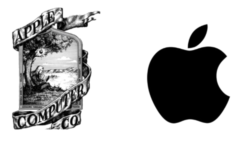
 Apple
Apple
This refresh may not be as recent as the other ones but it is certainly a drastic change for the best. Apple, the largest company in the world, is synonymous with a sleek design and a modern look on all its products. Looking at their old logo though you wouldn’t think this was the case. The original Apple Computers Co logo was a complex stretch of Sir Issac Newton sitting under an apple tree, now picture that on the back of your phone. It’s a change for the best, take a look:
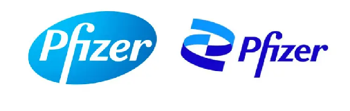
 Pfizer
Unless you’ve been living under a rock you’ll have heard of Pfizer by now. They are the world's largest pharmaceutical company and have manufactured all kinds of drugs and vaccines. Their new logo is a significant update taking inspiration from the double helix shape of human DNA. It is also meant to symbolise the company's change from being a commerce-based healthcare company to a business looking to eliminate diseases.
 So there you have it, our picks for brands who have changed their logo for the better. If you want help redesigning your logo or are looking to grow your business check out our design and marketing services or get in touch with us.